As I admittedly procrastinate on Issue Five, the final chapter that closes out this first Kitt Frost arc, I’ve found myself doing something equally important: setting the look and feel for what comes next.
This pause hasn’t been idle. It’s been exploratory.
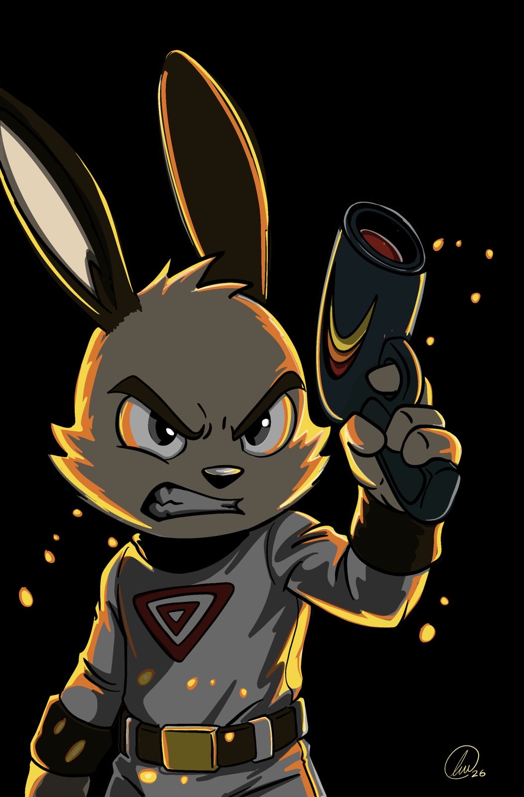
While the story waits, the art keeps moving.
A Shift in Visual Language
For the next phase of Kitt Frost, I’m making a deliberate stylistic evolution:
- Full-color covers moving forward
- Interiors anchored in black line art with dark blue watercolor shading
- Selective use of additional color accents, sparingly and intentionally
Why?
Because I like it.
More specifically, I like the mood it creates.
The dark blue watercolor paired with black outlines brings a weight and atmosphere to the page that aligns with where the story is heading. It feels colder. Quieter. More introspective. There’s space for shadow without drowning the page in full color.
Now that the book exists in color at all, this approach gives me freedom; freedom without obligation.
I don’t have to color everything to make it feel alive.
From Halftone to Watercolor

I realized something mid-experiment: I’m already shading with halftones. Conceptually, watercolor isn’t a departure, it’s a parallel. It’s the same idea expressed with a different tool.
The watercolor washes, especially in that dark blue range, let me suggest depth, cold, and emotion without over-rendering. Black remains the backbone. Blue becomes the atmosphere. Anything else is a deliberate accent.
Testing the Idea (and Committing to It!)
What started as loose experimentation quickly turned into something more concrete. I pushed the idea further:
- A fully realized cover for Omnibus One (Issues 1–5 collected)
- Interior test pages using black line art with watercolor shading
- Variations in pose, tone, and expression to see how flexible the style really is
The result surprised me.
I LIKE IT!
So I’m keeping it.
Even if it costs a little more per book.
Reconciling an Old Philosophy
Originally, my commitment to black-and-white comics was philosophical. It was a conscious attempt to differentiate Kitt Frost from the overwhelming cacophony of color on the shelf.
That instinct wasn’t wrong.
But it also wasn’t complete.
At the end of the day, this project isn’t about market contrast first, it’s about expression. About choosing the tools that best serve the story I’m trying to tell, and the way I want to feel while telling it.
Style isn’t a rulebook. It’s a conversation between the artist and the work.
Right now, this is where that conversation has landed.
And I’m excited to see where it goes next.

Leave a Reply